BRANDING
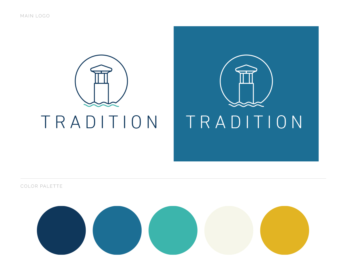
For Tradition’s rebrand, we updated their previous, classically ornamental logo with streamlined, modern typography for a fresh, new look that will not look dated anytime soon. A matching, “line-drawn” tower motif reflects the physical entrance towers of the community — in conjunction with water and sun (or moon!) — and makes a memorable lockup with the understated letterforms of the logo type.
We chose a color palette with bright, vibrant yellow, cream and aqua juxtaposed with both a brighter and a darker, rich blue. We often use these colors, arranged in stripes like mini-swatches, as a design element in eblasts and printed pieces.
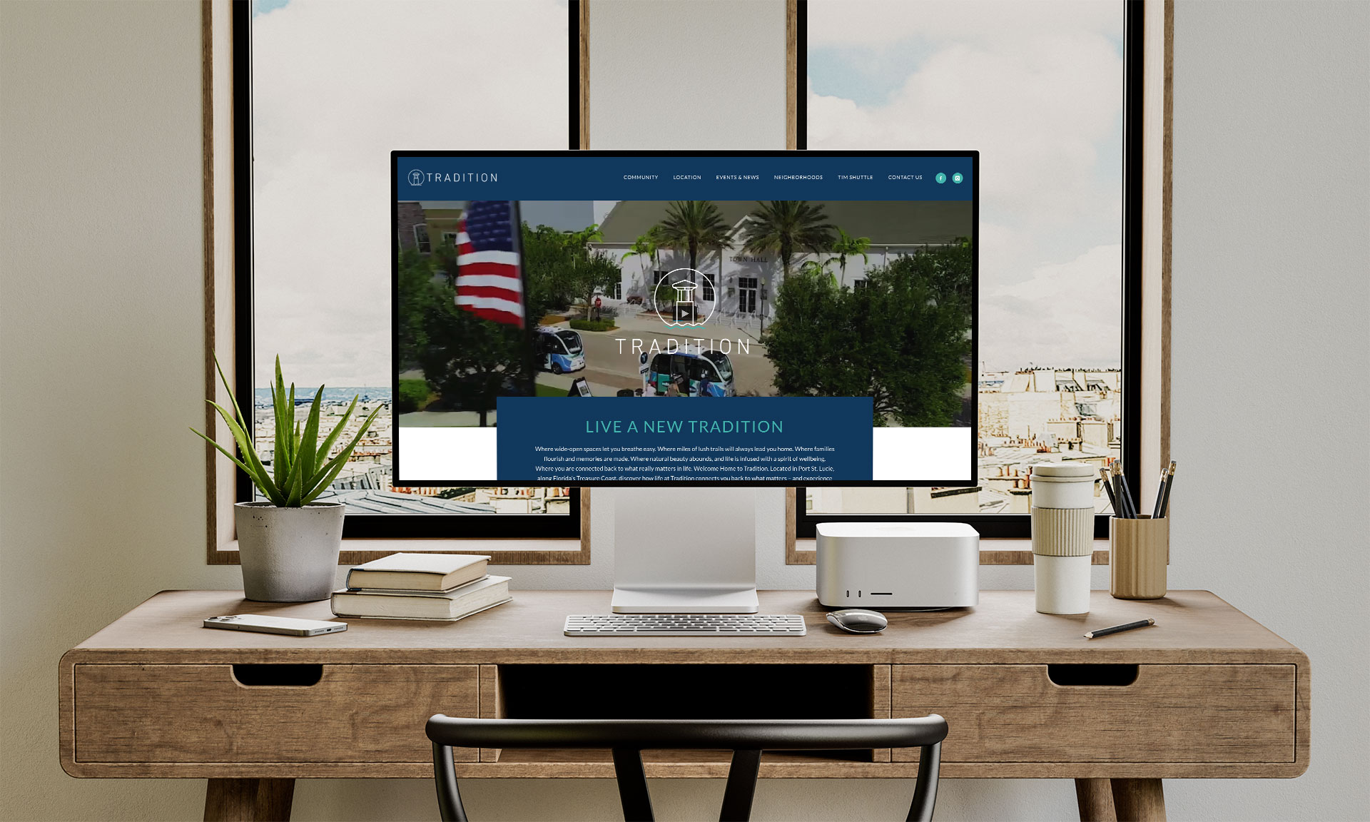
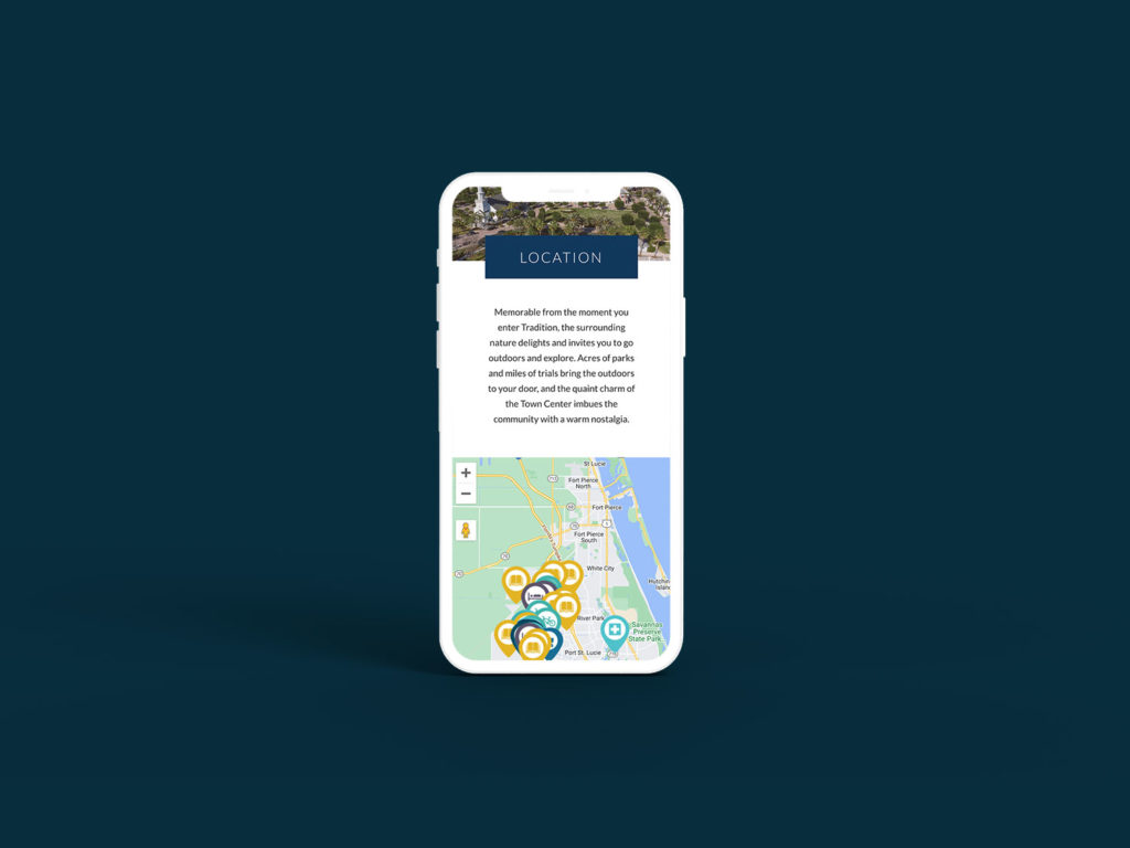
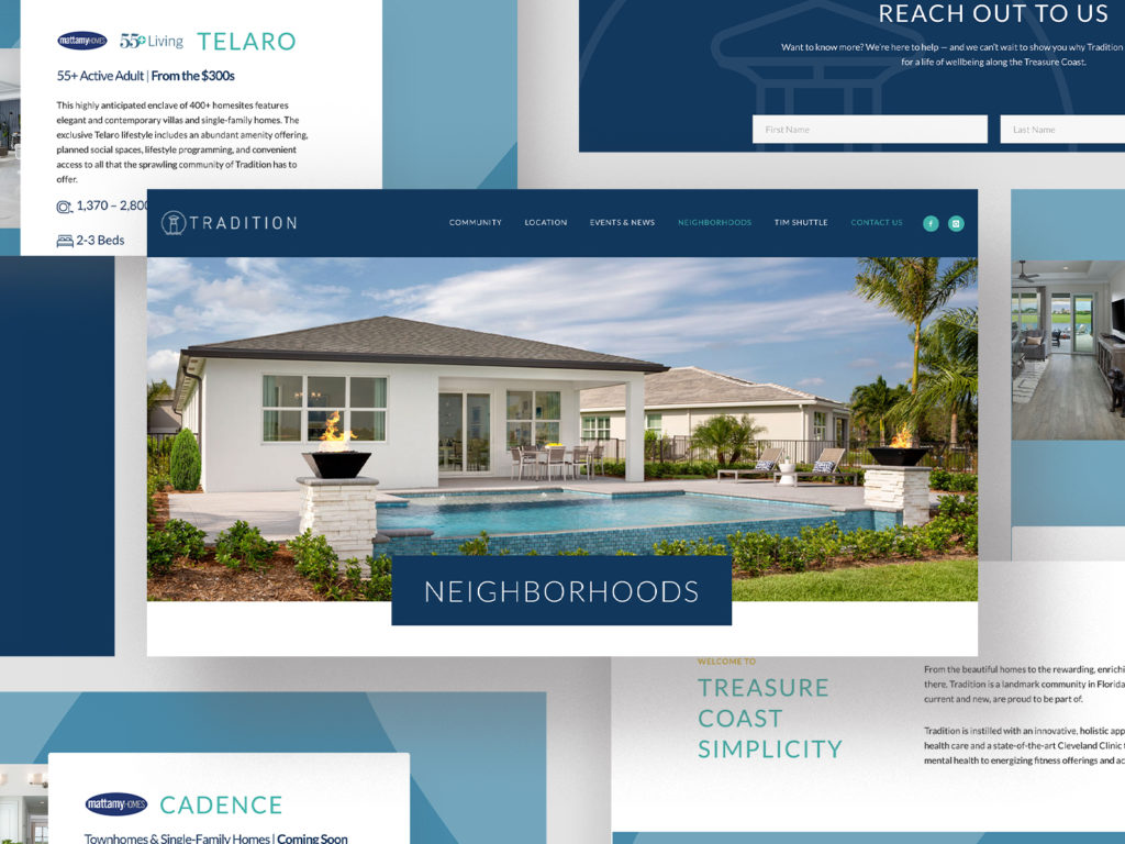
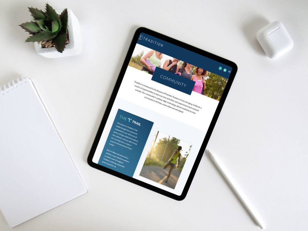
WEBSITE
Tradition is a nationally recognized, master-planned community in Port St. Lucie. They offer a lifestyle grounded in nature, with extensive trails and outdoor gathering areas — yet culture (outdoor art installations, live music) and technology (ebike share, autonomous shuttles) play a huge role in their amenity-rich offerings. The challenge was to encapsulate all aspects of this ethos with a site that deftly balances the natural, cultural and technological elements.
We designed a responsive site with a mix of video footage, still photos, carefully crafted modules and minimal-yet-meaningful copy describing all aspects of Tradition life. Neighborhoods, homes, amenities, tech perks and info about the surrounding areas are organized to be enjoyed either at a glance or in-depth.
In addition to regular events and expansion updates, we write the site’s blog entries about existing, expanding and proposed amenities around Tradition — and drive traffic to them via complementary eblasts.